

ASSET // INTERFACE DESIGN
The branding process for a tool like “ASSET – Lifecycle Assessment” forced me to develop a brand identity that accurately represents the values and mission of the organisation behind the tool. The resulting brand identity is simple but visually appealing, easily recognisable, and memorable. Given the focus on sustainability and reducing carbon footprint, the brand identity incorporates the loop symbol element to communicate environmental stewardship and responsibility.
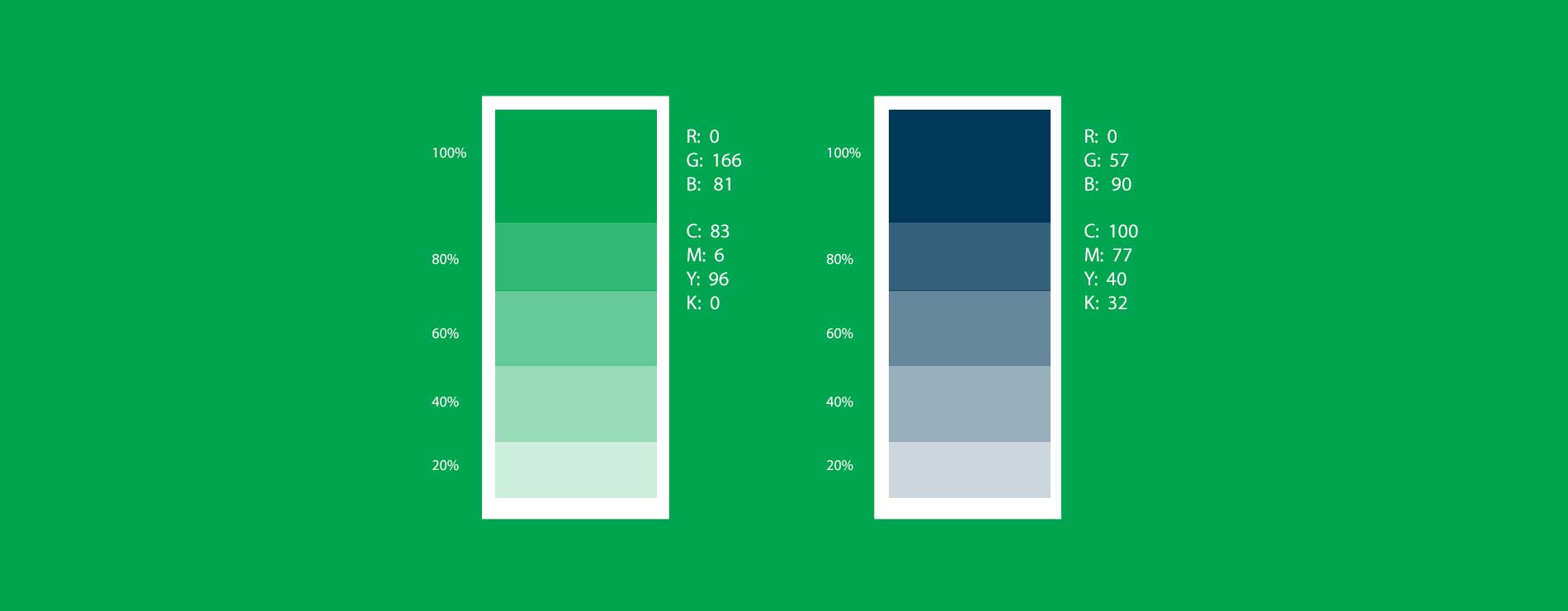
The design used green and blue colors to represent nature and the environment, as well as an unclosed loop to represent the idea of a circular economy. The design also incorporate a color code related to the ocean and forests to reinforce the connection to nature and the environment.
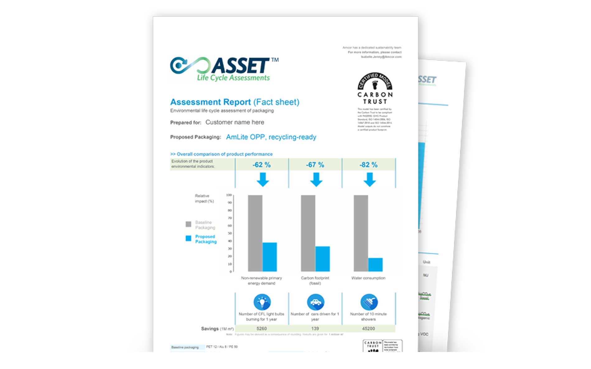
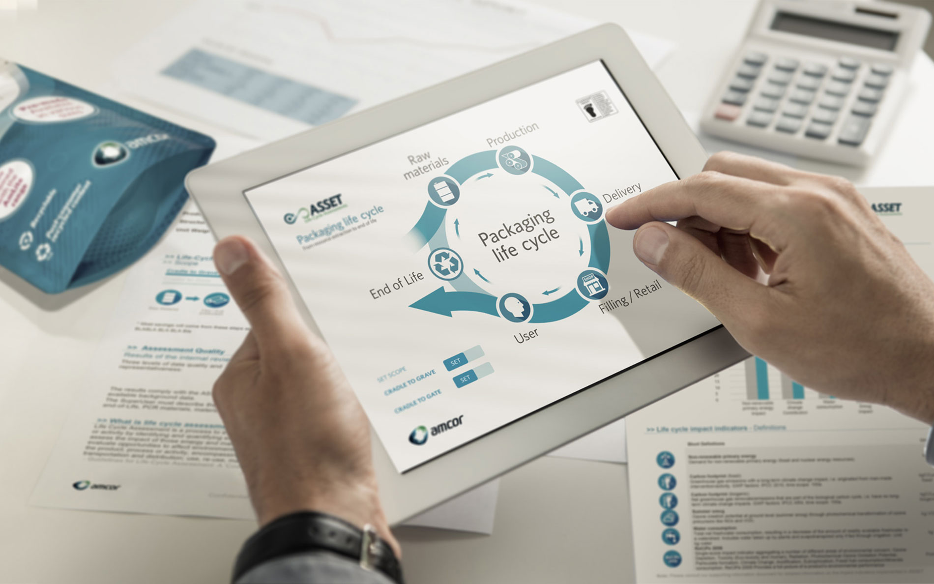
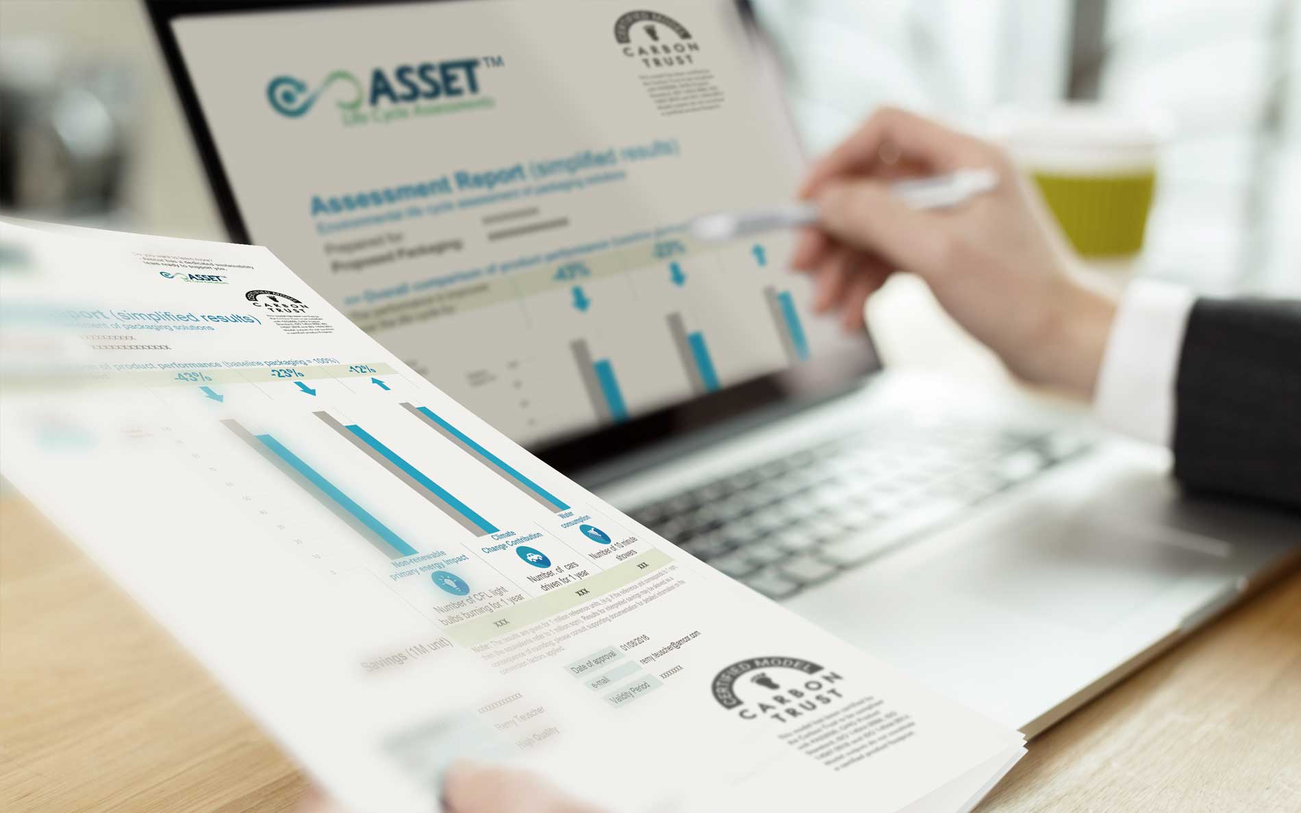
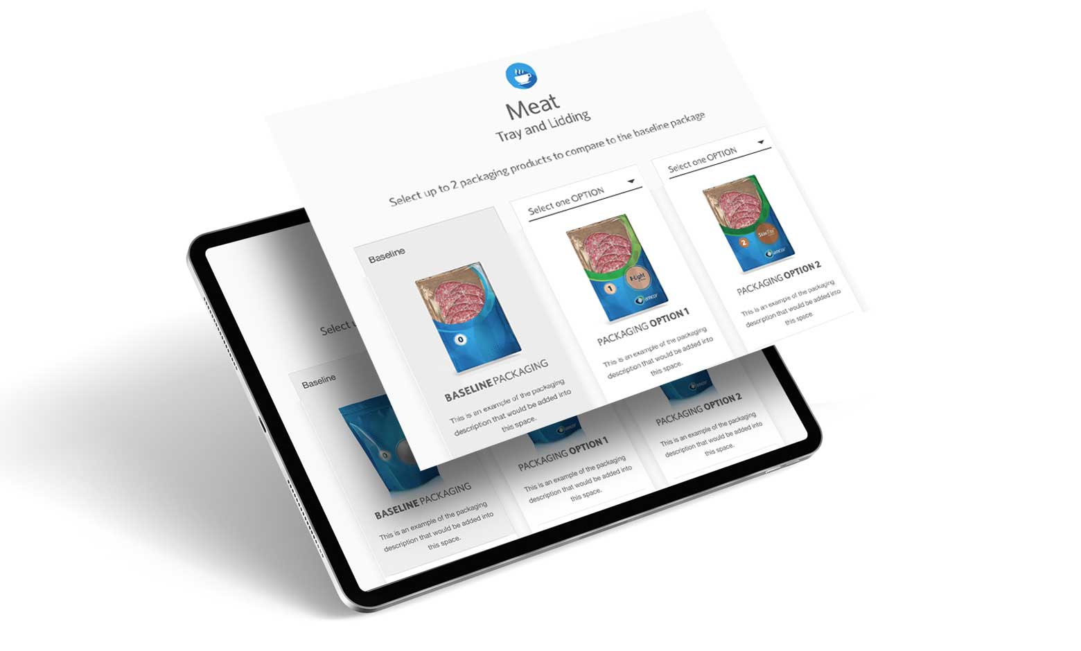
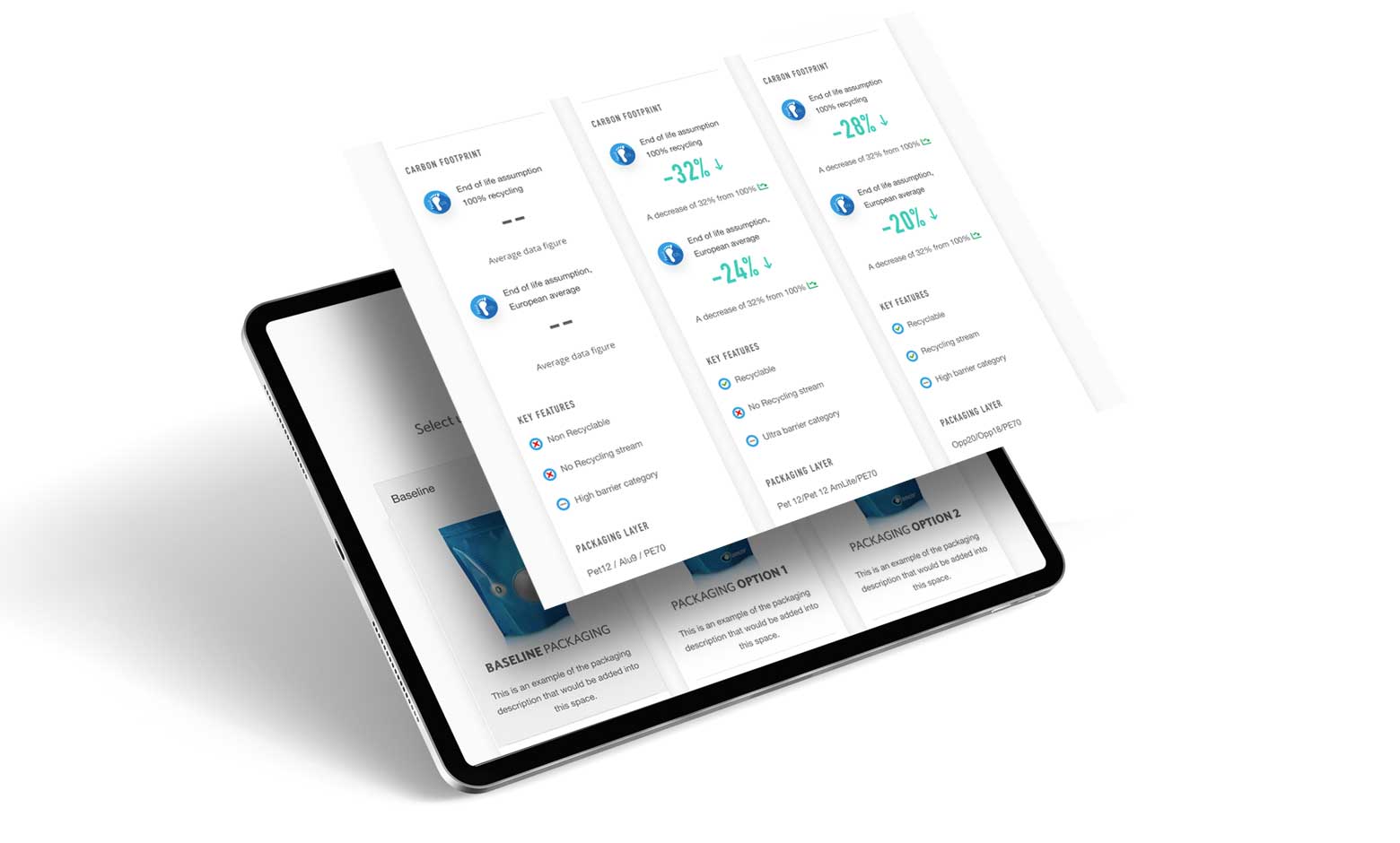
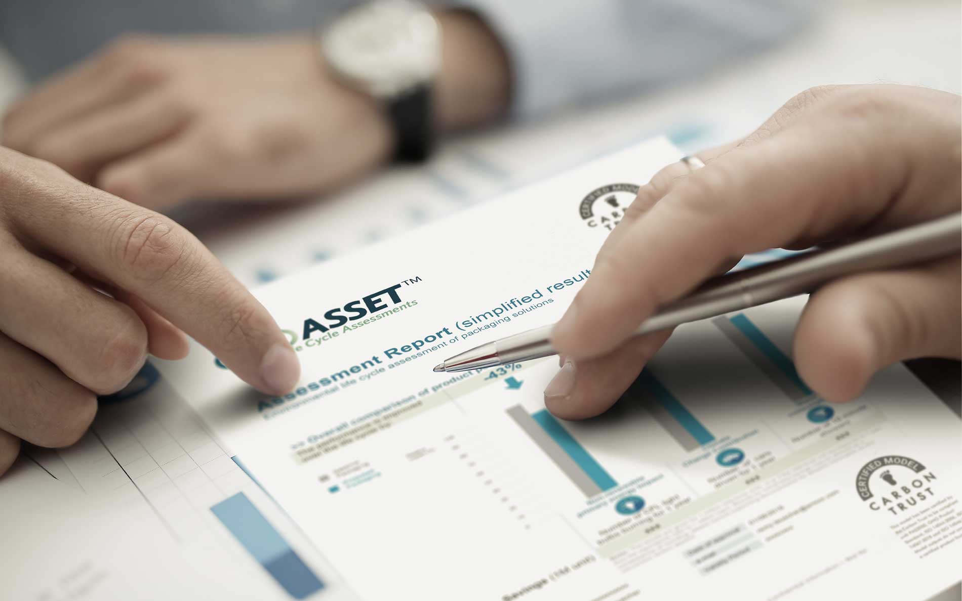
The result of the branding process and web app UX/UI design development for “ASSET” is be a visually appealing and user-friendly tool that effectively communicates the organisation’s values and mission. The communication campaign about the service includes visualisations of the tool in action.
Zurich 2018