
SVRA
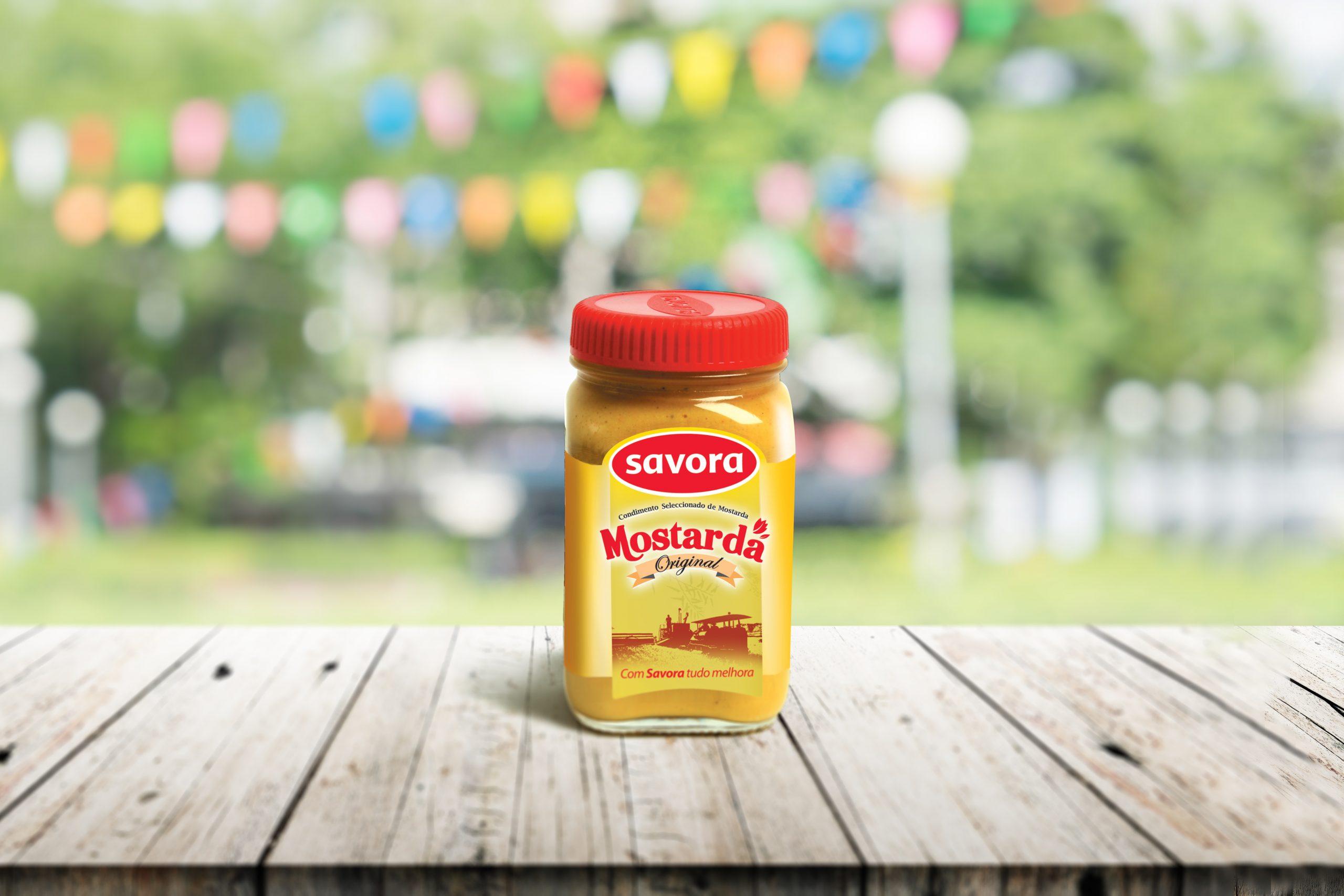
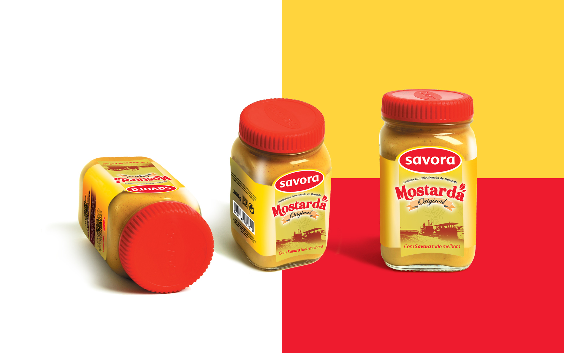
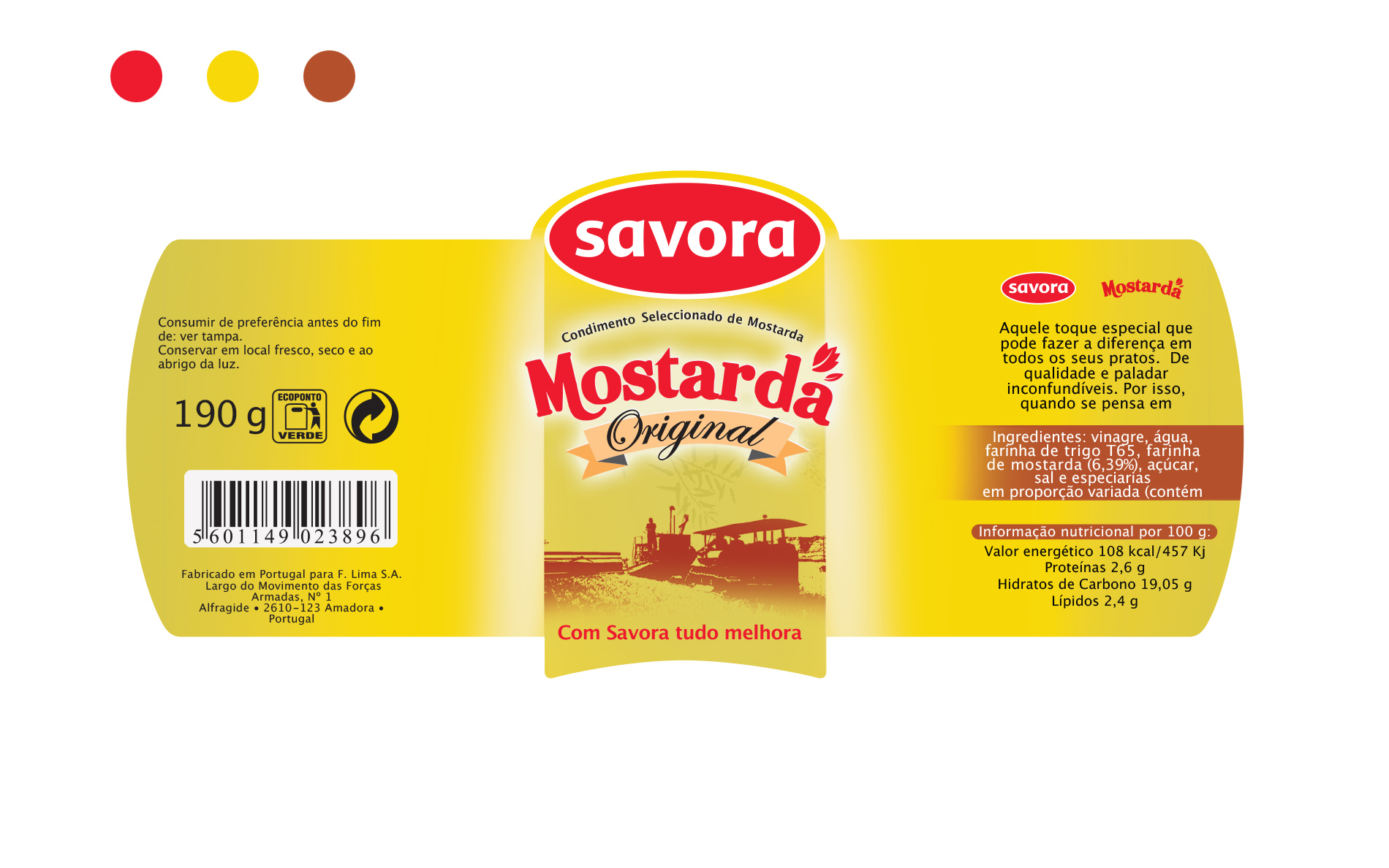
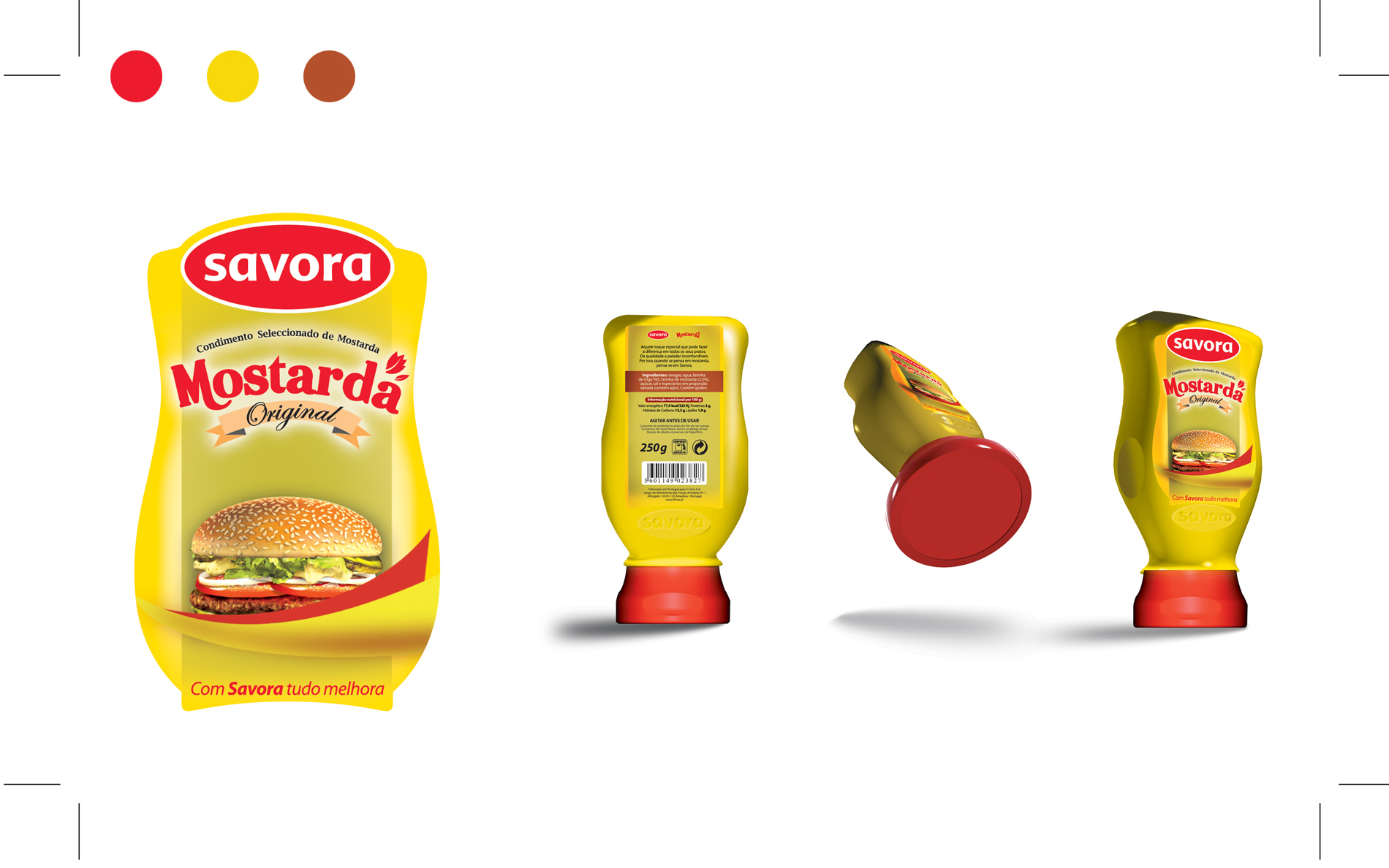
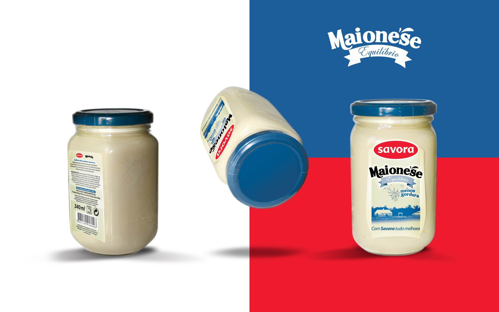
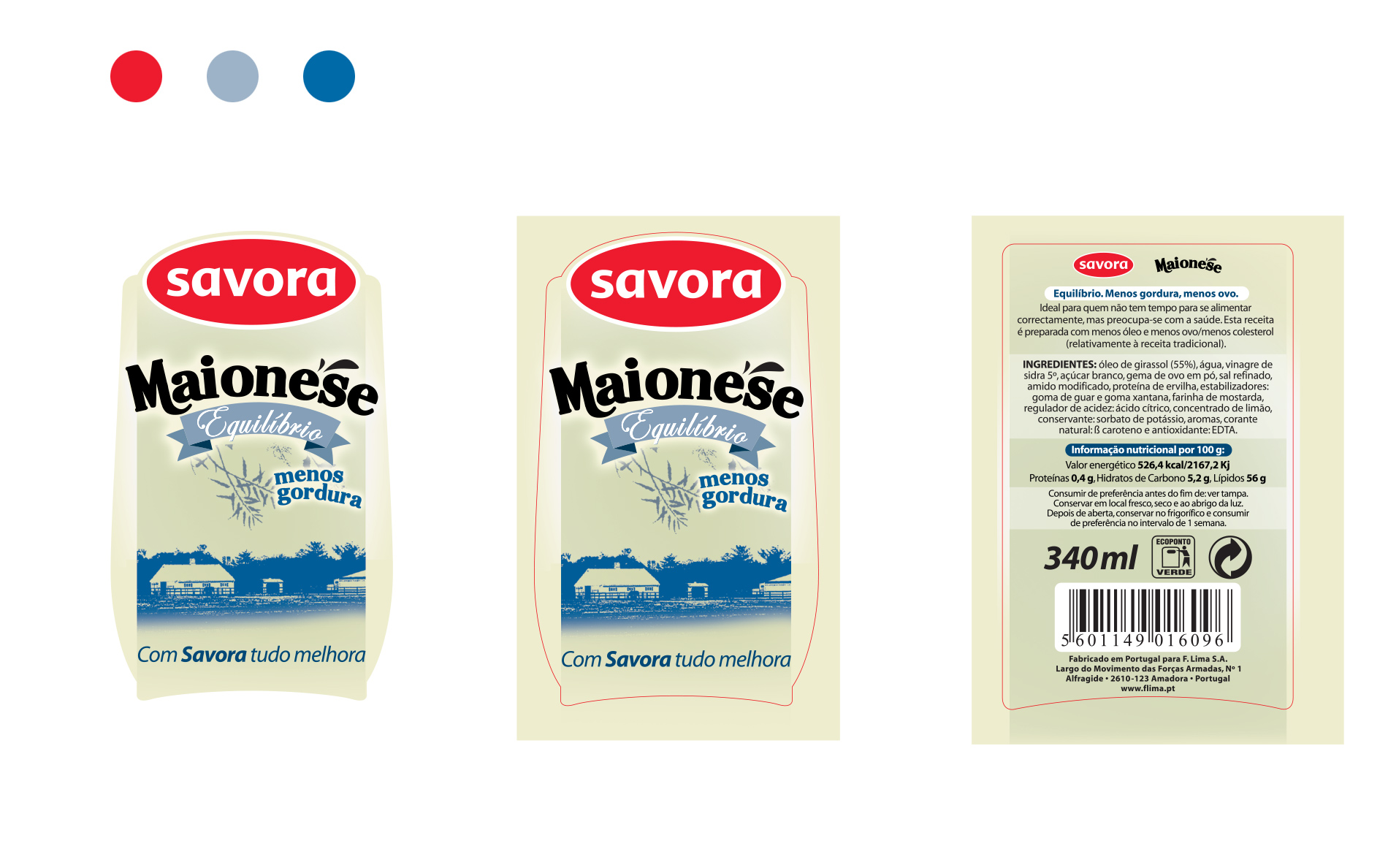
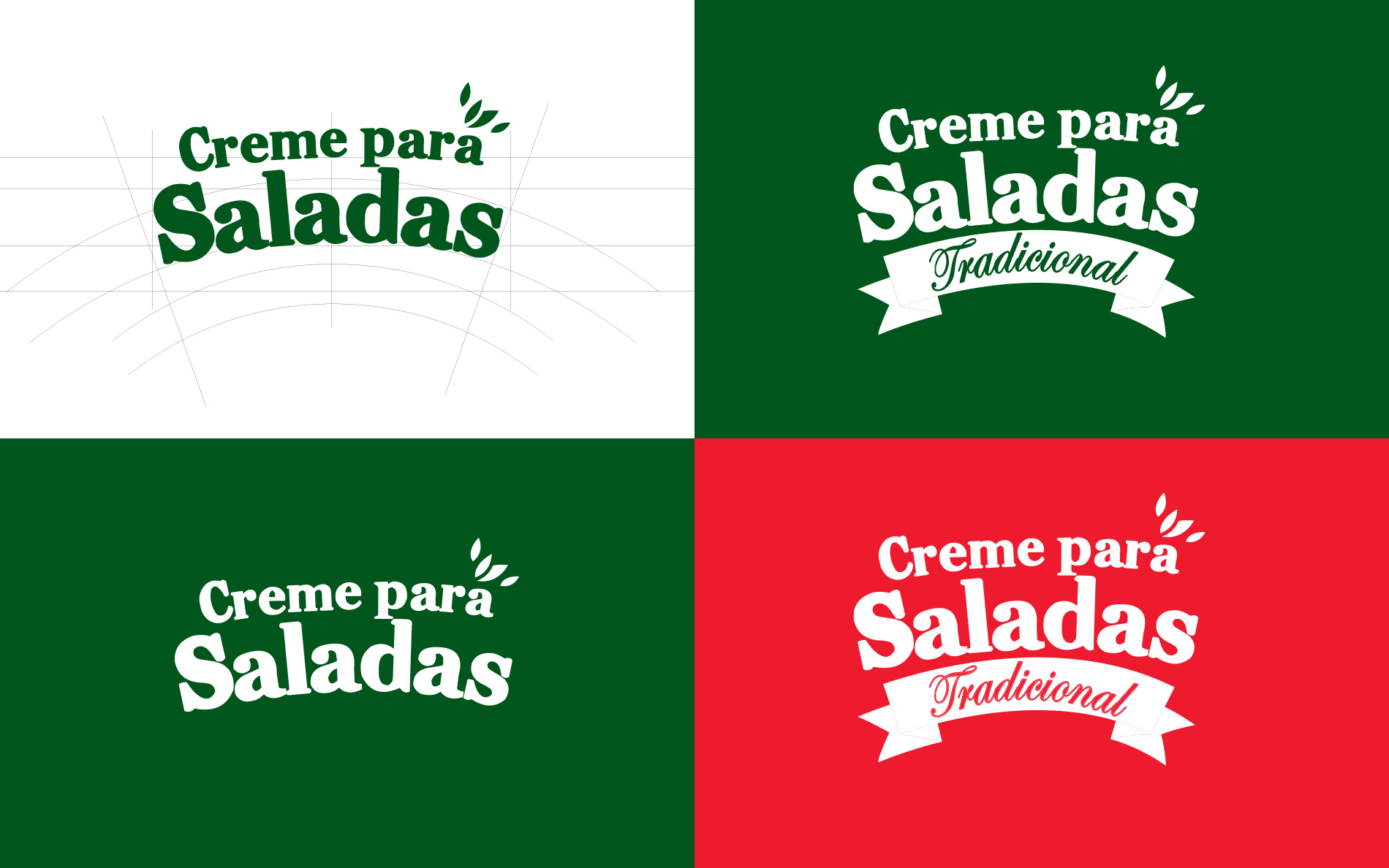
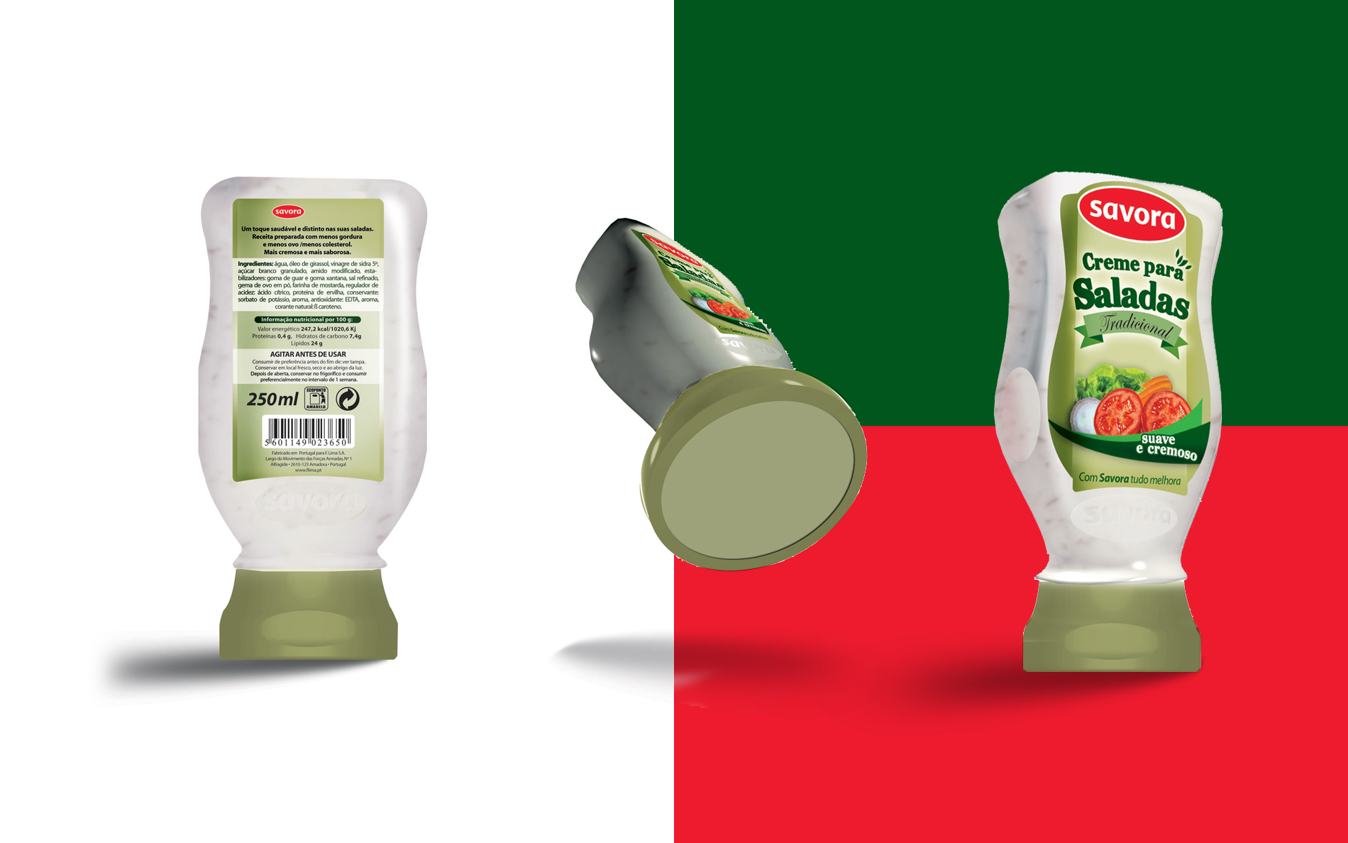
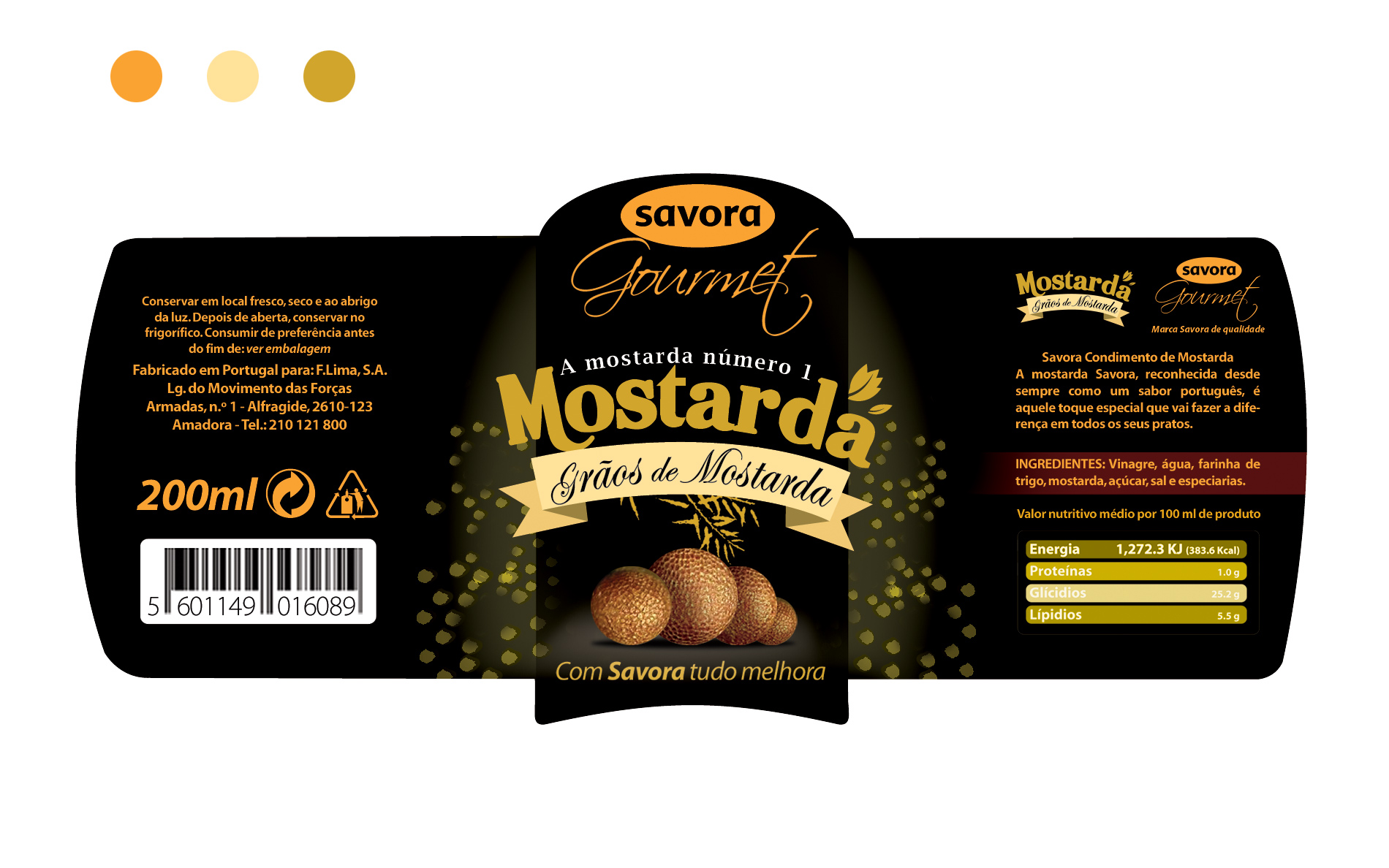
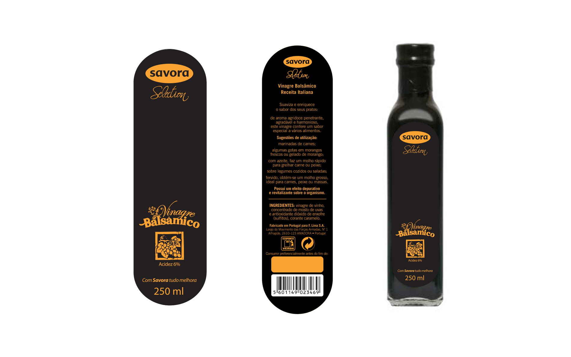
Brand ID and packaging Design for Savora’s collection of dippings and sauces.
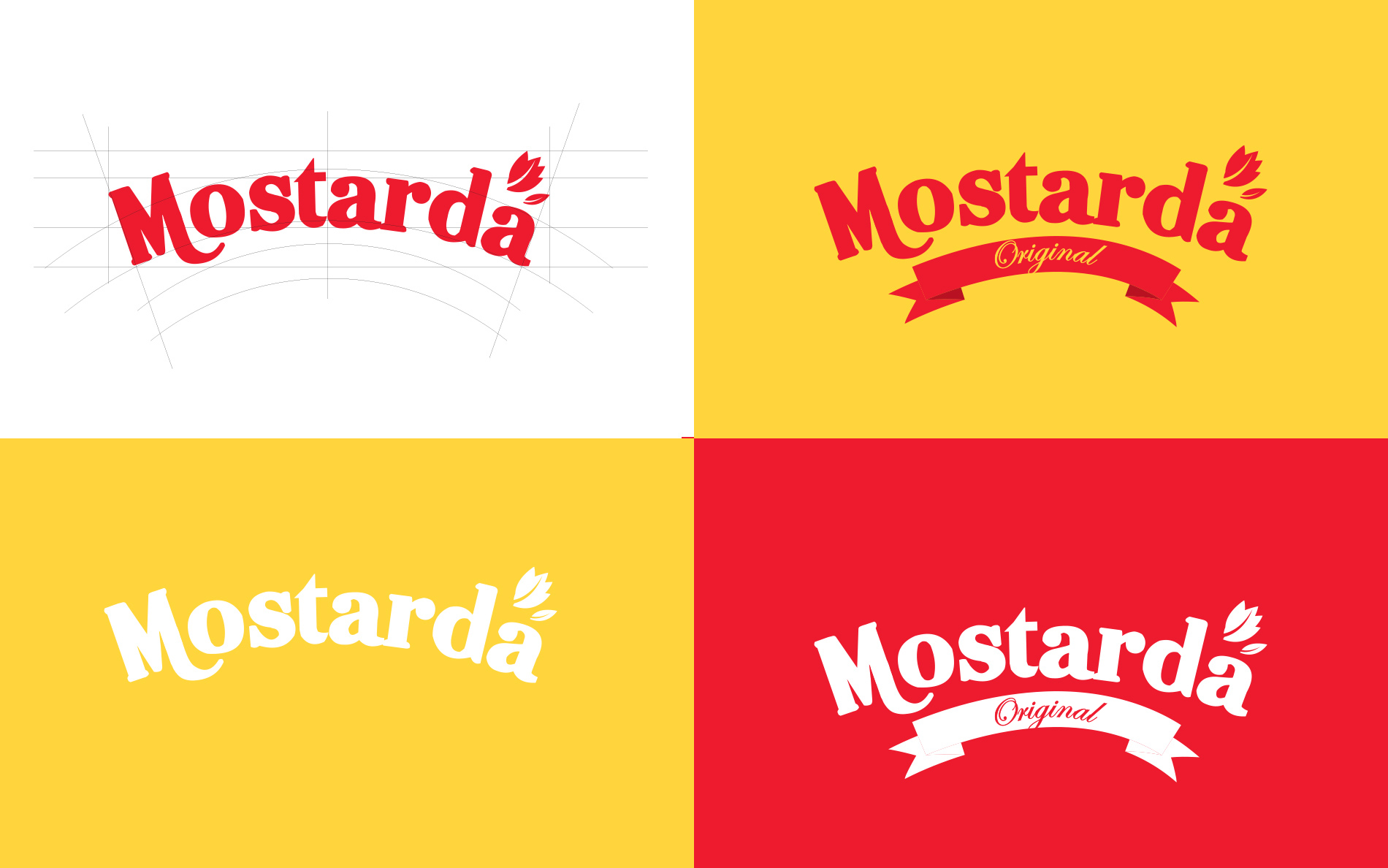
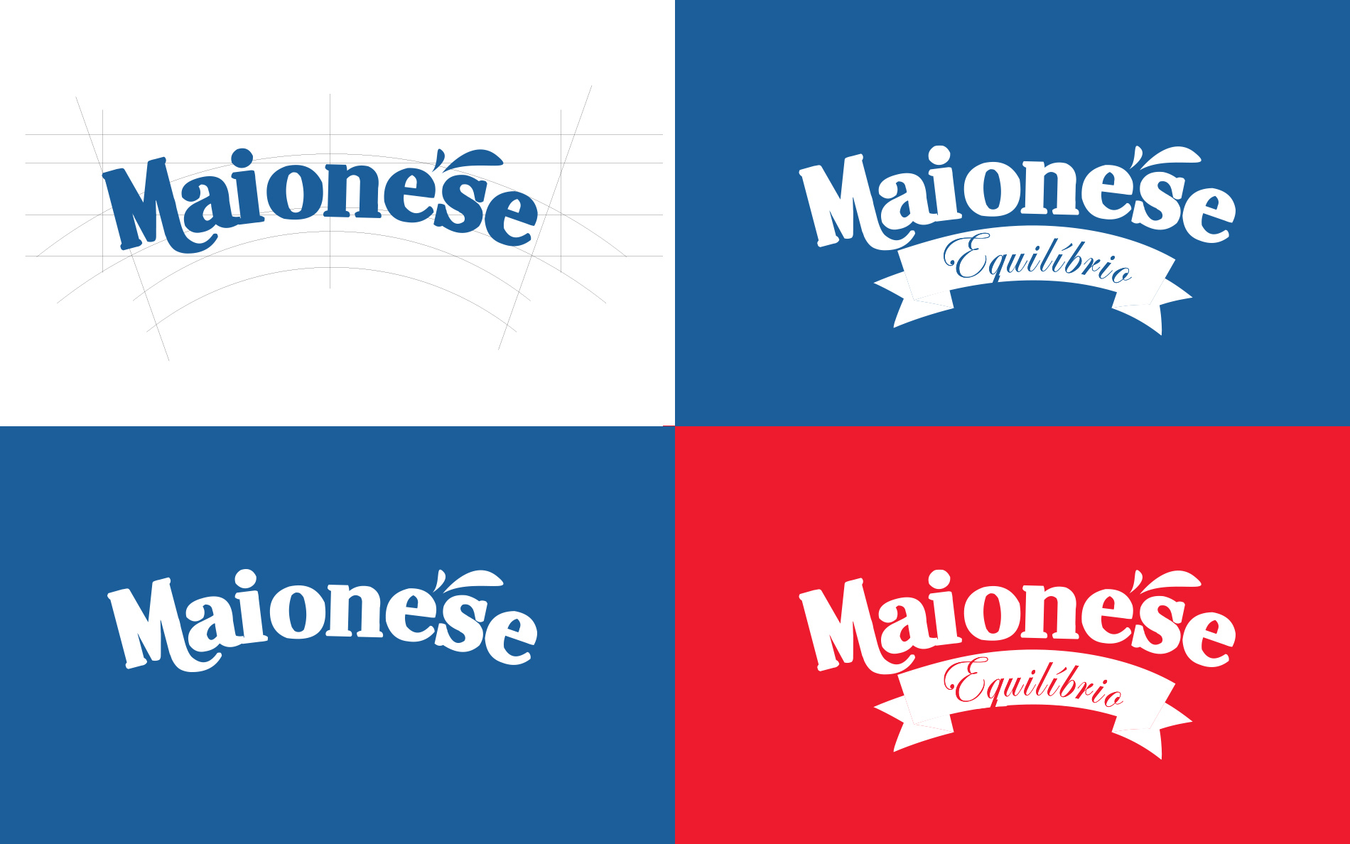
The use of traditional typeface suggests a sense of familiarity and tradition, which appeals to consumers looking for classic and reliable flavours. The photoshopish illustration style approach, on the other hand, may attract a younger audience who were drawn to more contemporary design aesthetics.
The use of different colors to reflect the product application is a smart way to make it easier for consumers to differentiate between the different flavours and products. This can be especially important in a crowded market, where consumers may be overwhelmed with choices.
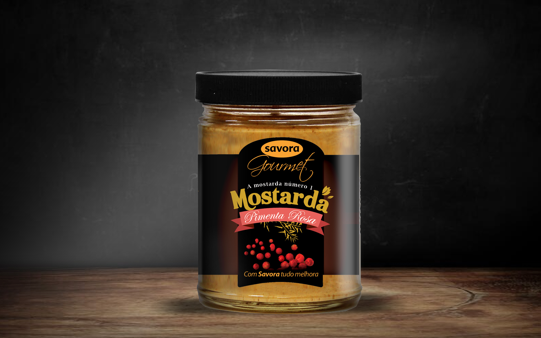
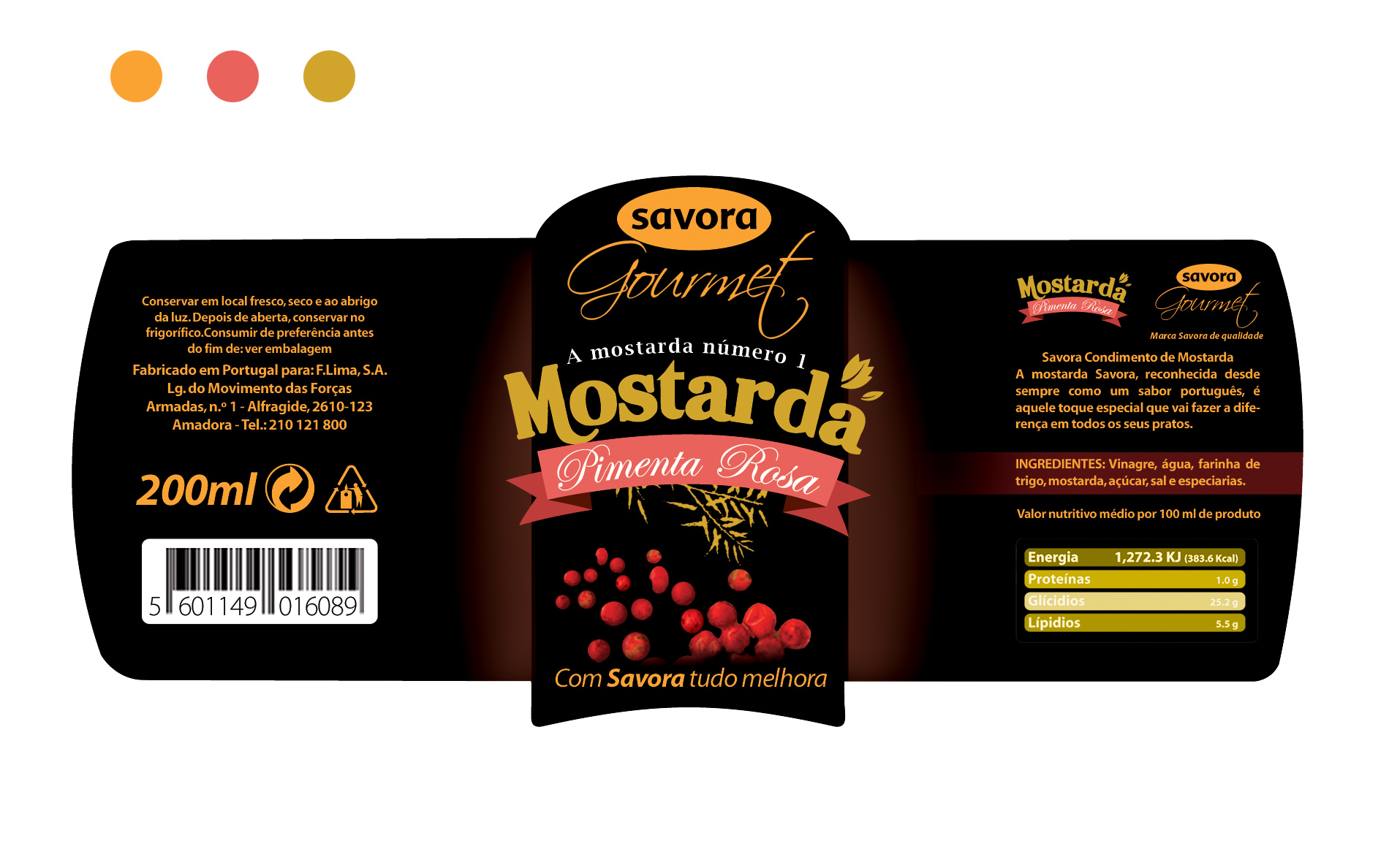
The inclusion of a gourmet version of some dippings, e.g. pepper based mustard, explores the brand need to target a more discerning consumer who is willing to pay a premium for higher quality products. This elevated the brand’s image and differentiate it from other more basic products on the market.
Lisboa 2006