
INTERPACK 2017
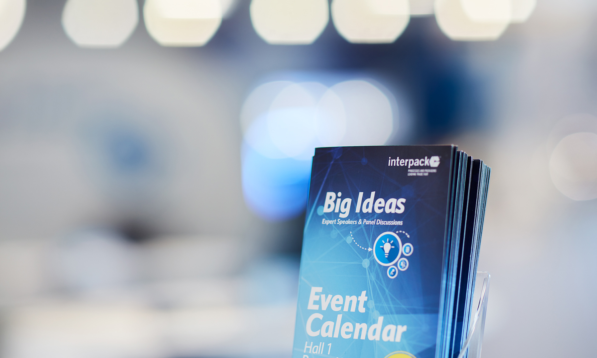
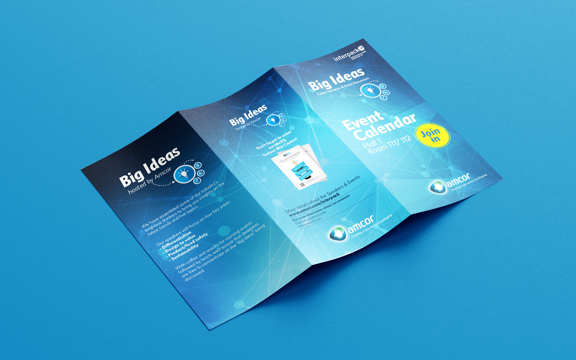
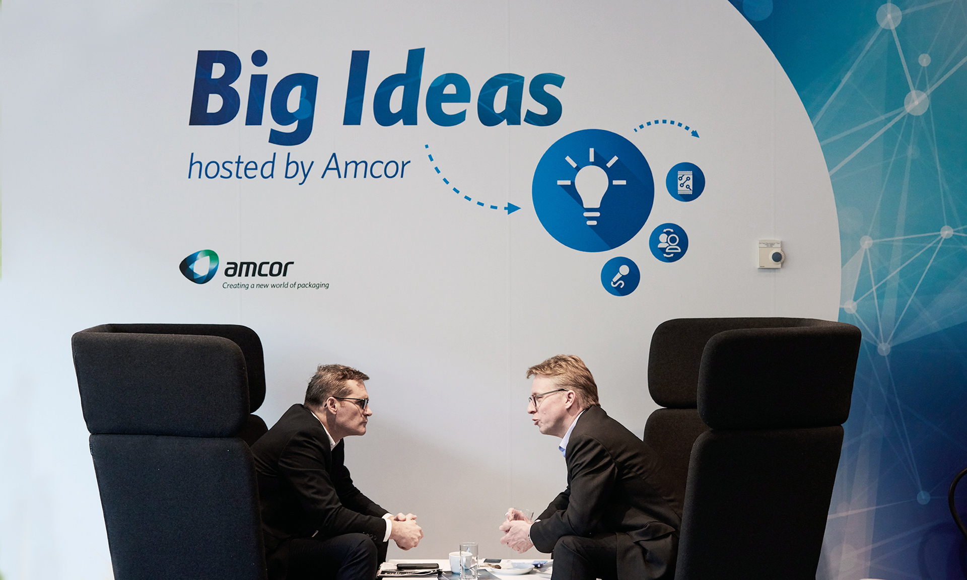
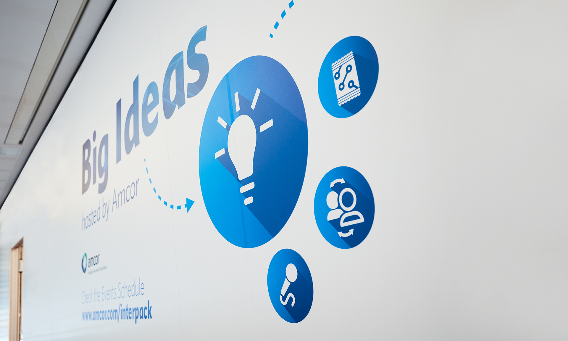
Brand identity for Big Ideas events development – It was delivered for conferences and webinars. It communicates the event’s focus on packaging, sustainability, and convenience for consumers by incorporating elements that are linked to Amcor’s main brand language.
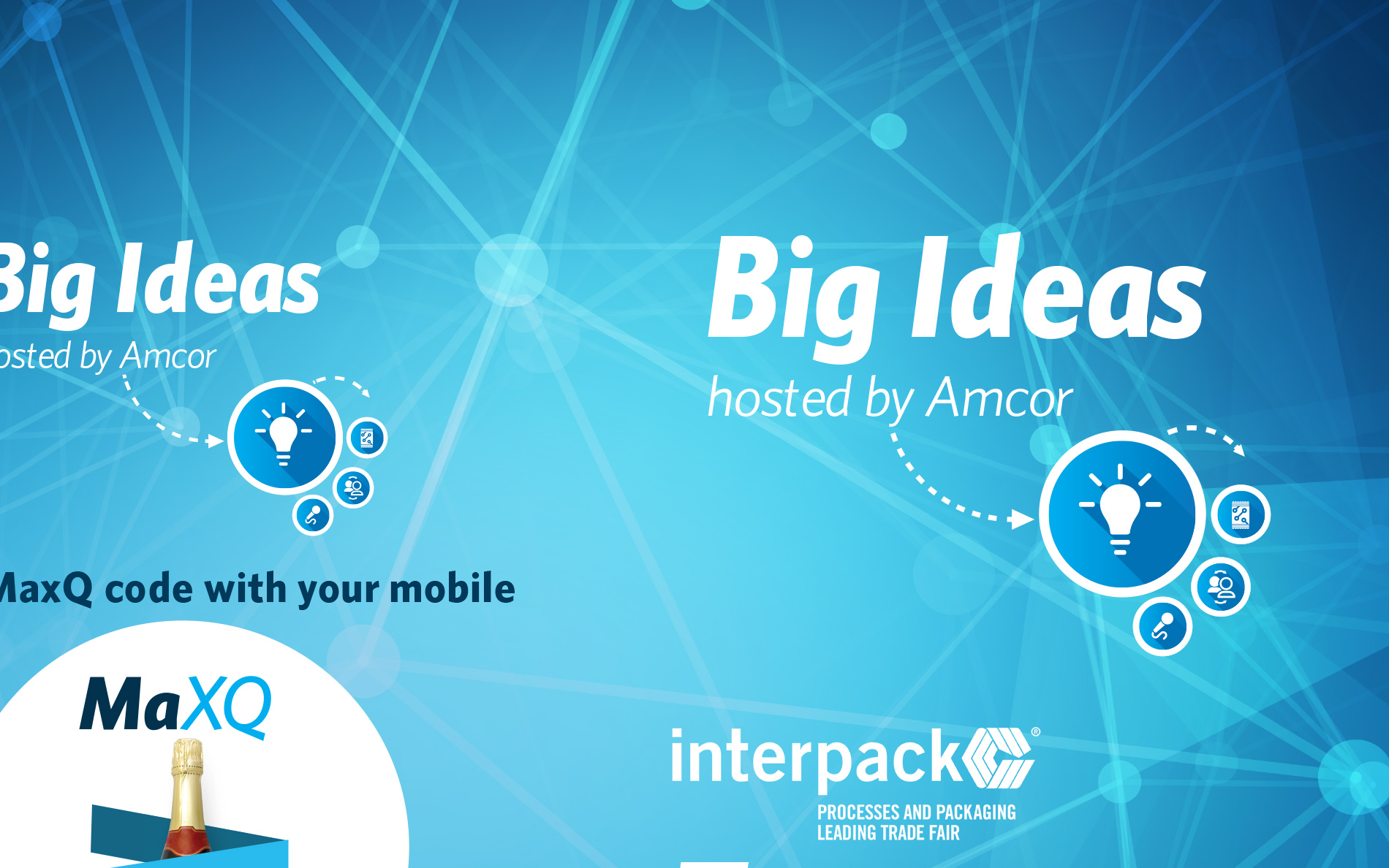
The use of blue color in the visual brand identity helps creating a connection with Amcor’s main brand language. – the use of a deep shade of blue conveys trust and reliability, while a lighter shade of blue communicates innovation and creativity.
An italic typeface was used for the event name and tagline to create a sense of movement and dynamism, while ensuring the font’s legibility and easy to read from a distance.
The layout of the visual brand identity is clean and uncluttered, with ample white space to ensure that the design is easy to read and understand.
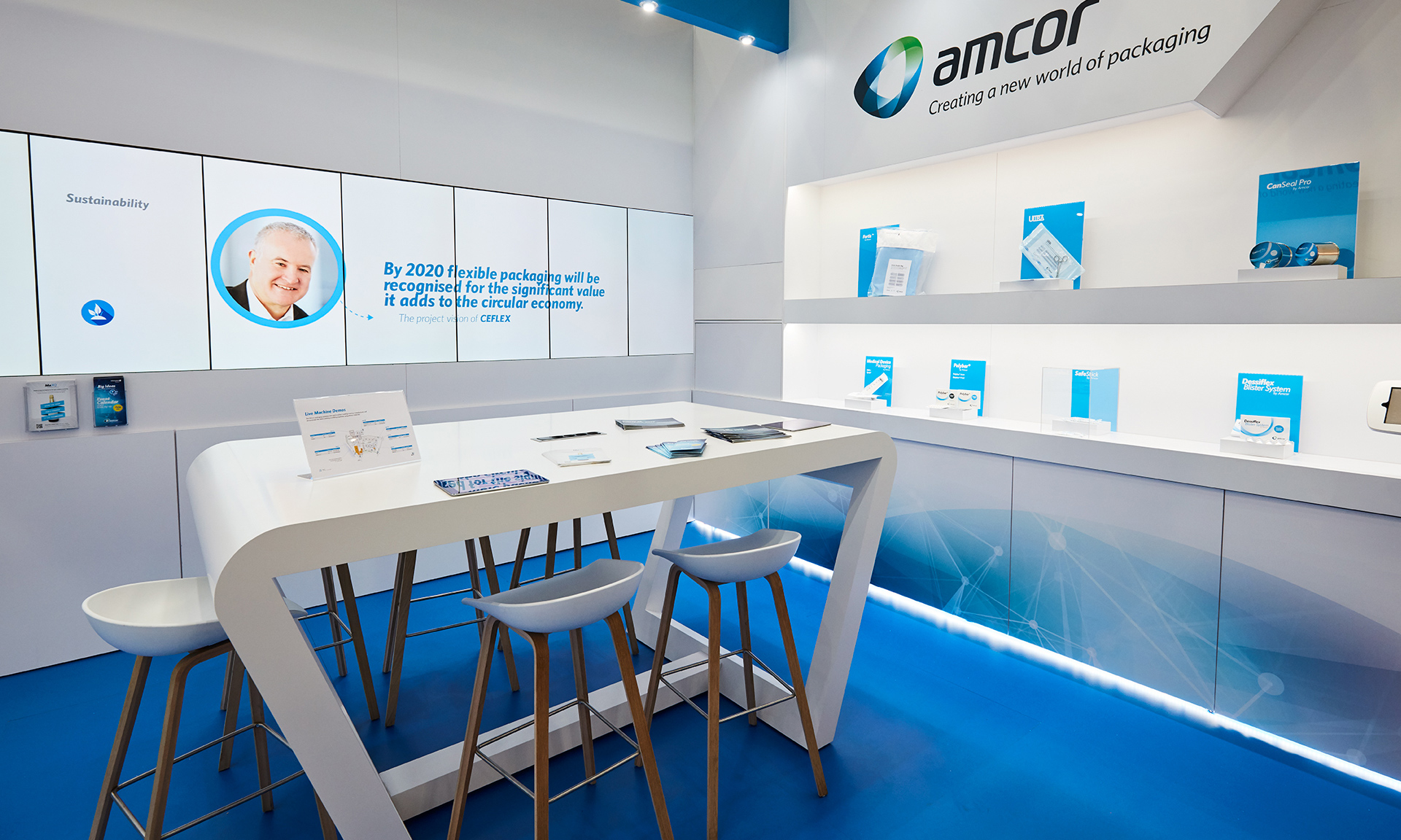
Premiered in INTERPACK 2017 – it’s still used today in several spin-off digital and physical events
Zurich 2017